Moloko website
Project overview
The goal of this project was to make the website more user friendly. Make it clear for the customer what Moloko does and has to offer in terms of organised rides and renting bikes.
My contributions
I've been involved from beginning till the end. Helping defining the target audience, create personas, user journeys till creating wireframes and prototypes. Design different landing pages to make the website more user friendly with a focus on mobile as well.
Defining Moloko
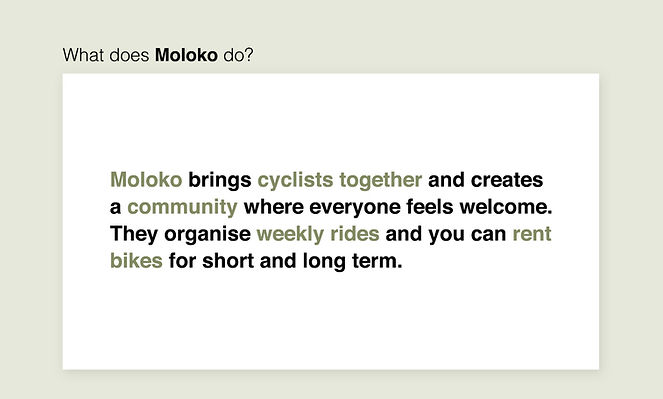
Starting with the basics we did a brainstorm to define the Moloko brand. By doing this it quickly became clear they are not just about renting out bikes but want to build a community and organise rides to bring cyclists together and make it fun for everyone.
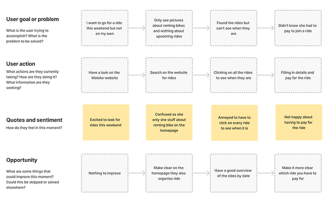
Creating personas
The next step was to create different personas and walk through all the steps of the existing website. By doing this it was easy to see what was already good and what was missing or unclear.

Wireframing
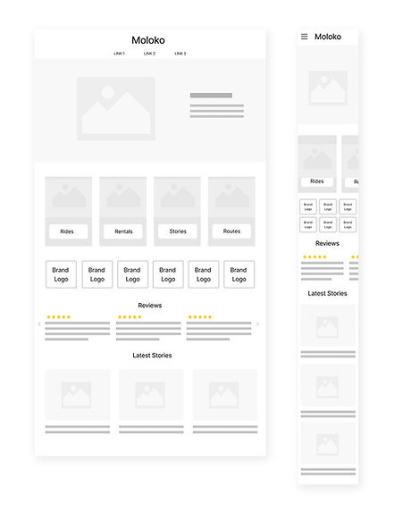
After doing the user journey's it was clear that some parts of the website were not working well. The homepage was confusing as it was only showing bike rentals, the landing page for the rides was not showing a good overview of when the rides were happening. Enough to improve which is why I first made wireframes for both of the pages to explore the possibilities.
Visual exploration
Next I moved to exploring the overall look of the website. They already
hada good look and feel that they wanted to keep. So I looked for
betterimages that fit with the new design. Gave them some examples
for what type of images they could use for the header image and the
sub categories.
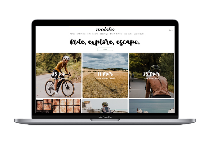
Final UI design
The last step was to design the prototypes and build the pages in WIX for them to use. We went through all the pages and made some last changes before putting it live.